Landing
Landing Page — modern marketing landing page (one-shot).
What I asked each model — the Landing prompt
Every model on this page got this exact prompt inside the Agent Operating System: Landing Page — modern marketing landing page (one-shot).
Single HTML file out. No iteration. No examples in the system prompt. Whatever each model produced on the first run is what's on this page. 24 frontier models have attempted it so far: Claude Fable 5, Fugu Ultra, Fugu Mini, Fusion, Gemini 3.6 Flash, GLM-5.2, GPT-5.6 Sol, Grok, Inkling, Kimi K2.7, Kimi K3, MiniMax M3, Hermes MoA, Muse Spark 1.2, Opus 4.8, Claude Opus 5, Qwen 3.8, Qwen 3.7, Claude Sonnet 5, Kimi K2.7 · Fast, Kimi K2.7 · No-Think, Kimi K2.7 · Quality, DeepSeek V4 Pro, DeepSeek V4 Flash.
Why this task matters. Landing is a textbook test of page-class capability — the kind of build that exposes whether a model is doing pattern-matching or actual reasoning. Shipping this cleanly is the floor for what I expect from a frontier model — every model on the leaderboard should at least attempt it.
How each model handled Landing
Ranked by my 0–10 score from the source comparison guides on agentos.guide. Click any to play the actual one-shot HTML the model produced.
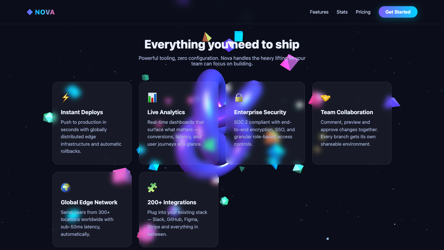
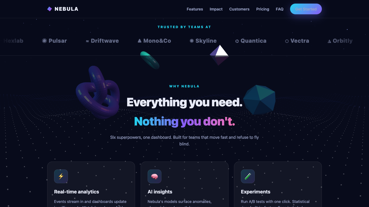
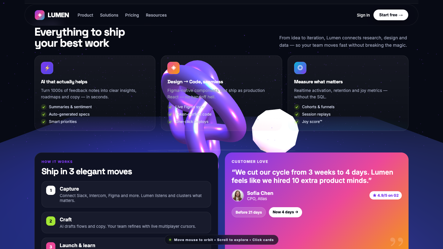
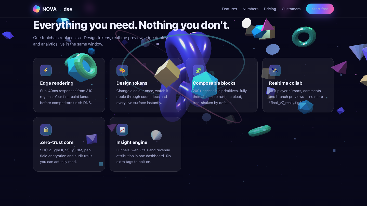
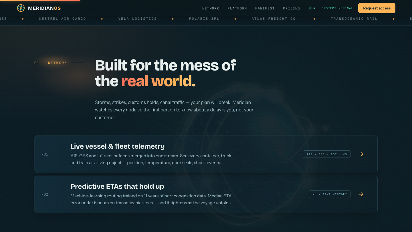
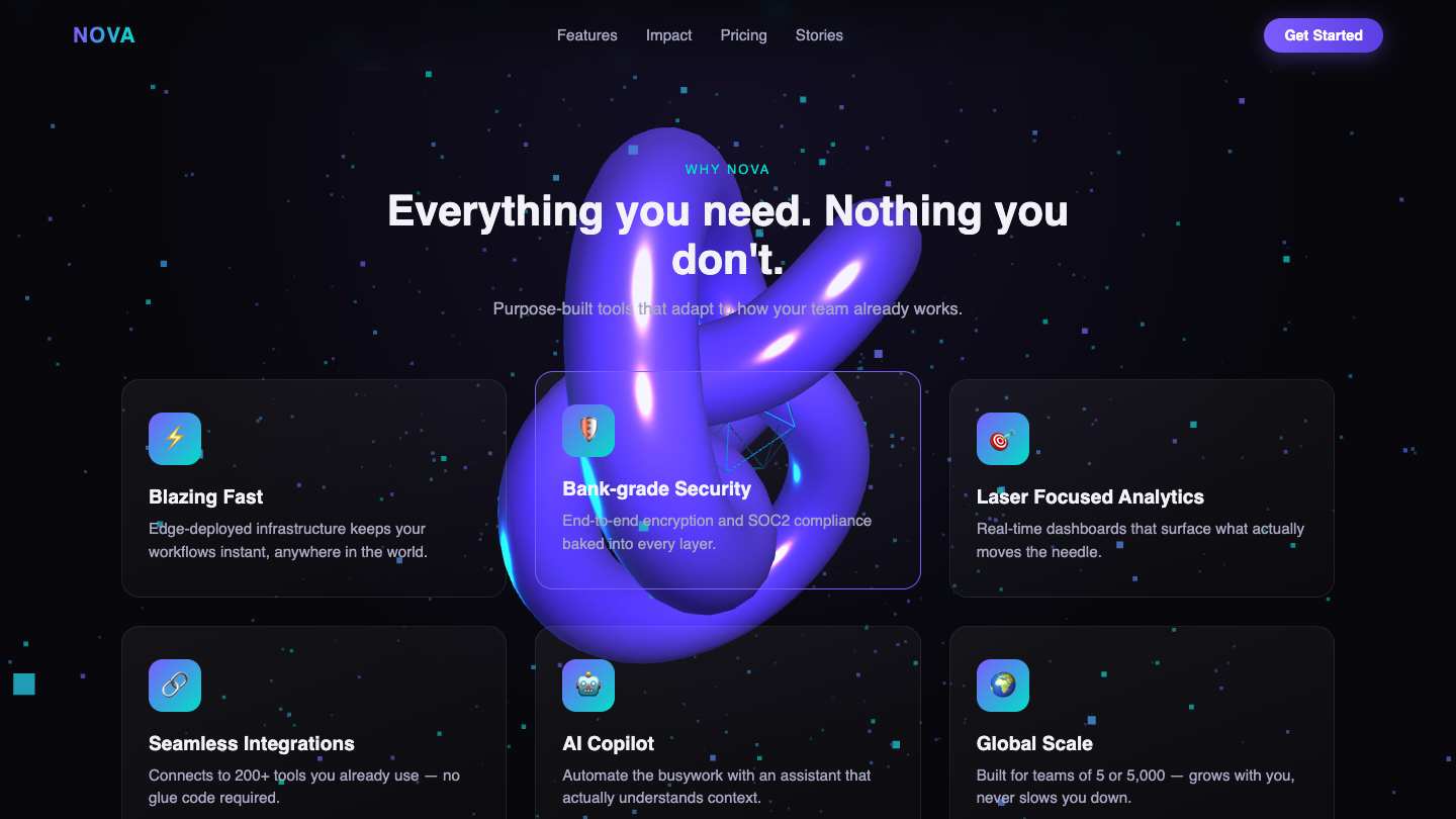
What I saw: Renders with a slick animated 3D starfield, floating shapes, and clean glassmorphic feature cards, but the screenshot captures the features section with the torus knot visually intruding over card text — a composition/legibility issue that undercuts polish. Strong tech and theme cohesion, but the overlapping 3D object bleeding into content keeps it below the field's best.
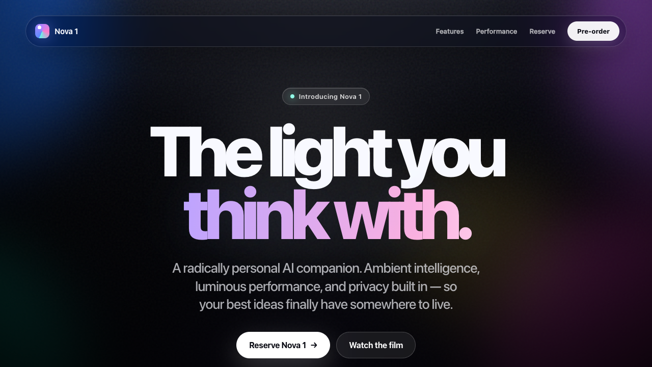
What I saw: Sakana Fugu Ultra shipped a 32KB Apple-keynote landing — bigger than Fusion's 20KB attempt at the same prompt. Animated mesh gradient, multi-section, polished. $0.32 vs Fusion's $1.30 for the same output — 4× cheaper, denser result.
What I saw: Landing page — by design has no input. Smoke-test MAYBE-STATIC is expected for a static-design prompt.
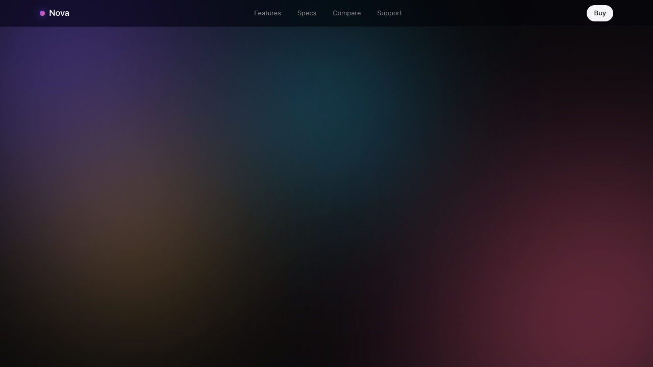
What I saw: Animated mesh-gradient background (4 drifting blobs in screen blend), noise grain overlay, vignette, glass nav with smooth scroll. Reads like an actual Apple product page. Better composed than any other landing attempt.
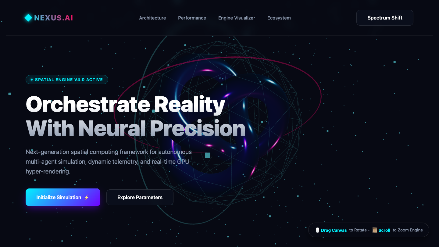
What I saw: Stunning interactive Three.js WebGL background with glowing neural sphere, crisp gradient headline, polished glass CTAs, and thoughtful interactive controls (drag/scroll, spectrum shift) — visually elevated above a generic marketing page. Minor weak point is the somewhat filler AI-jargon copy, but the execution and depth clearly top-tier.
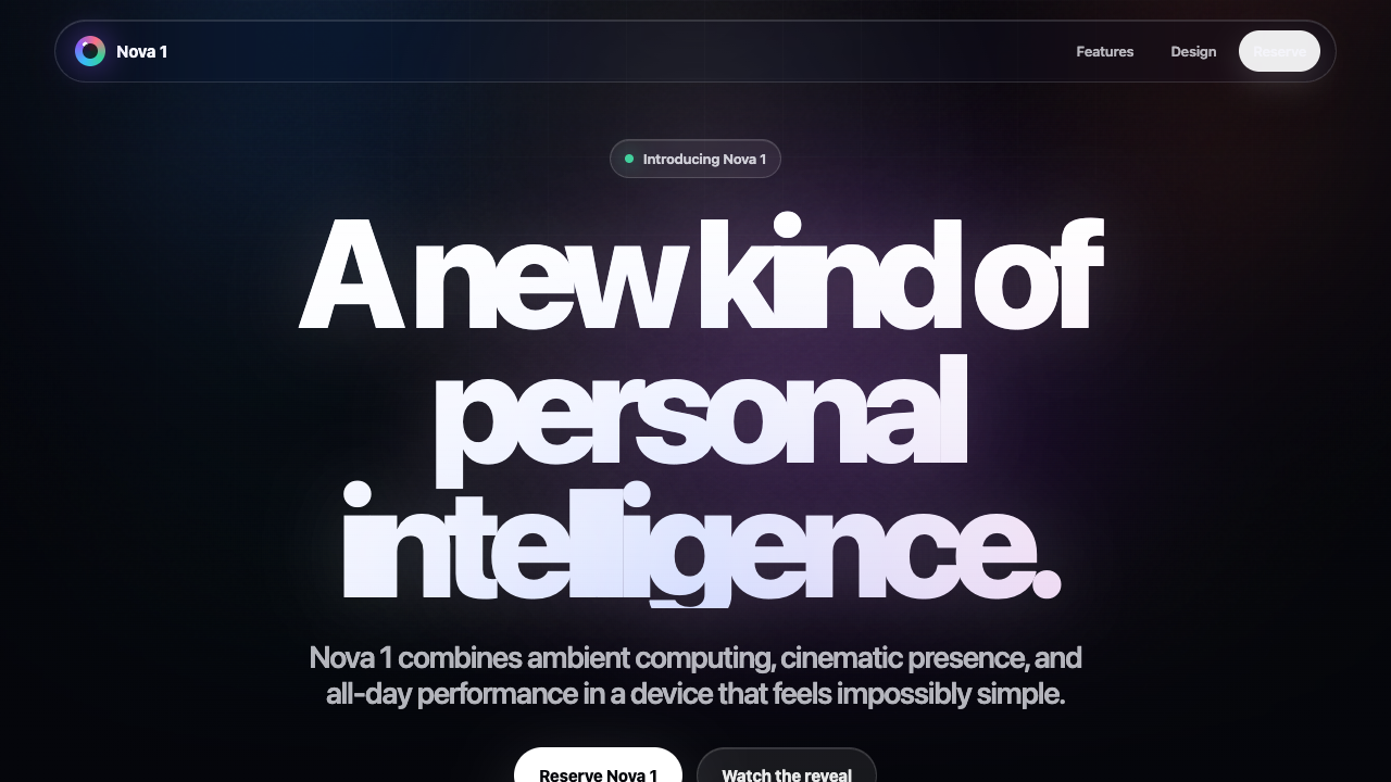
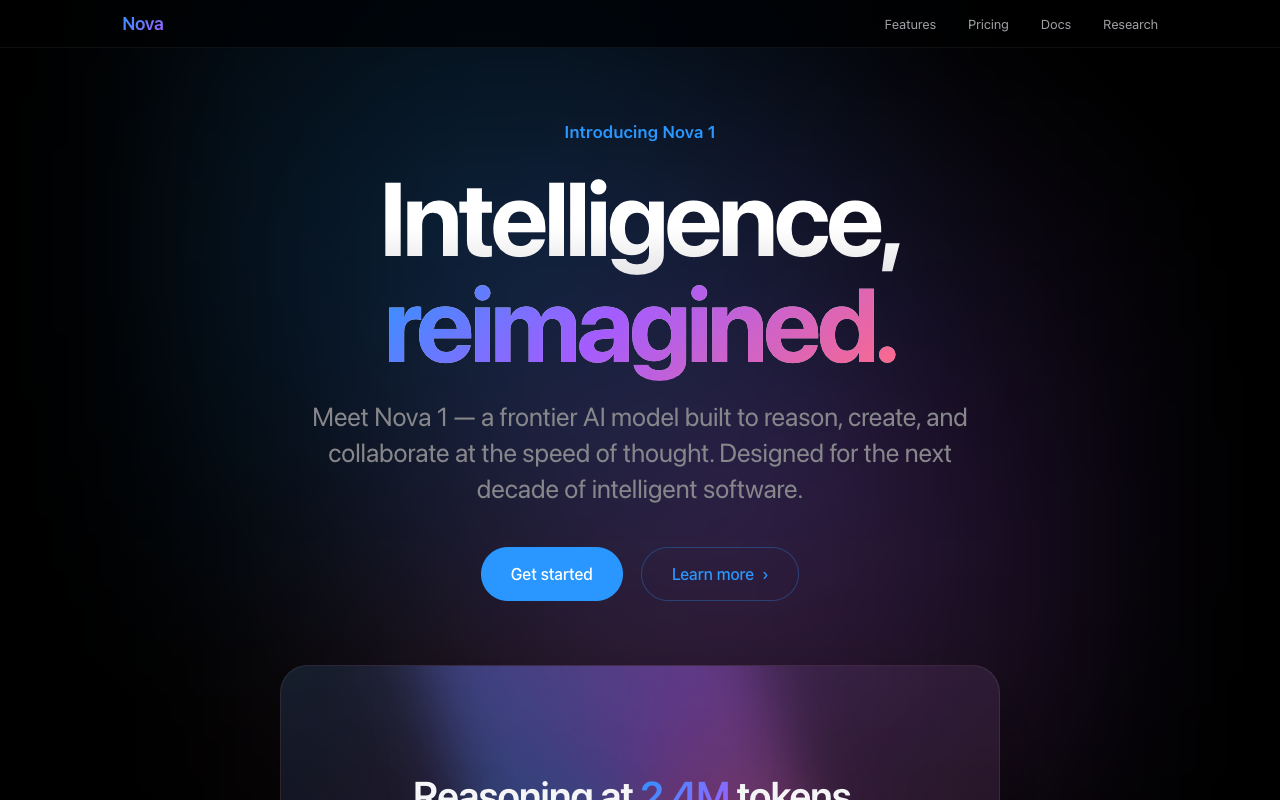
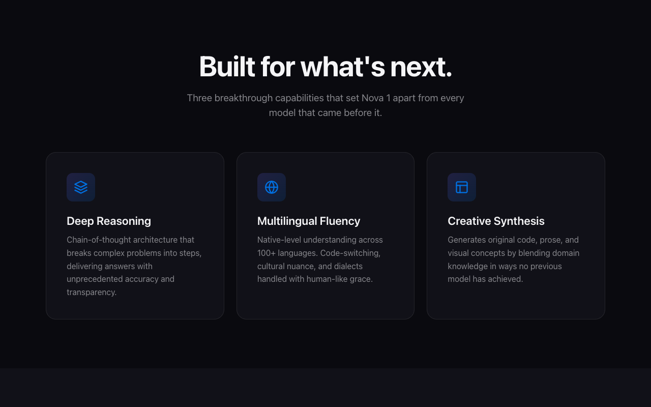
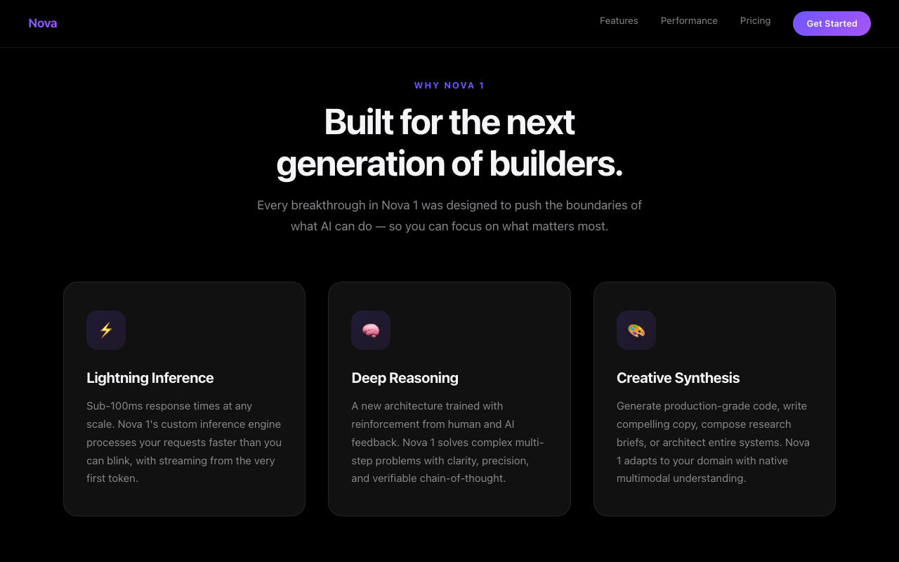
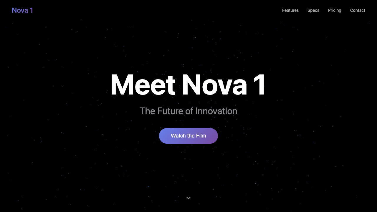
What I saw: Funniest result of the lot: GLM and Opus independently produced near-identical premium 'Introducing Nova 1 — Intelligence, reimagined / distilled' keynote pages — gradient hero, full nav, pricing tiers. A dead heat. Kimi's was a plainer set of feature cards.
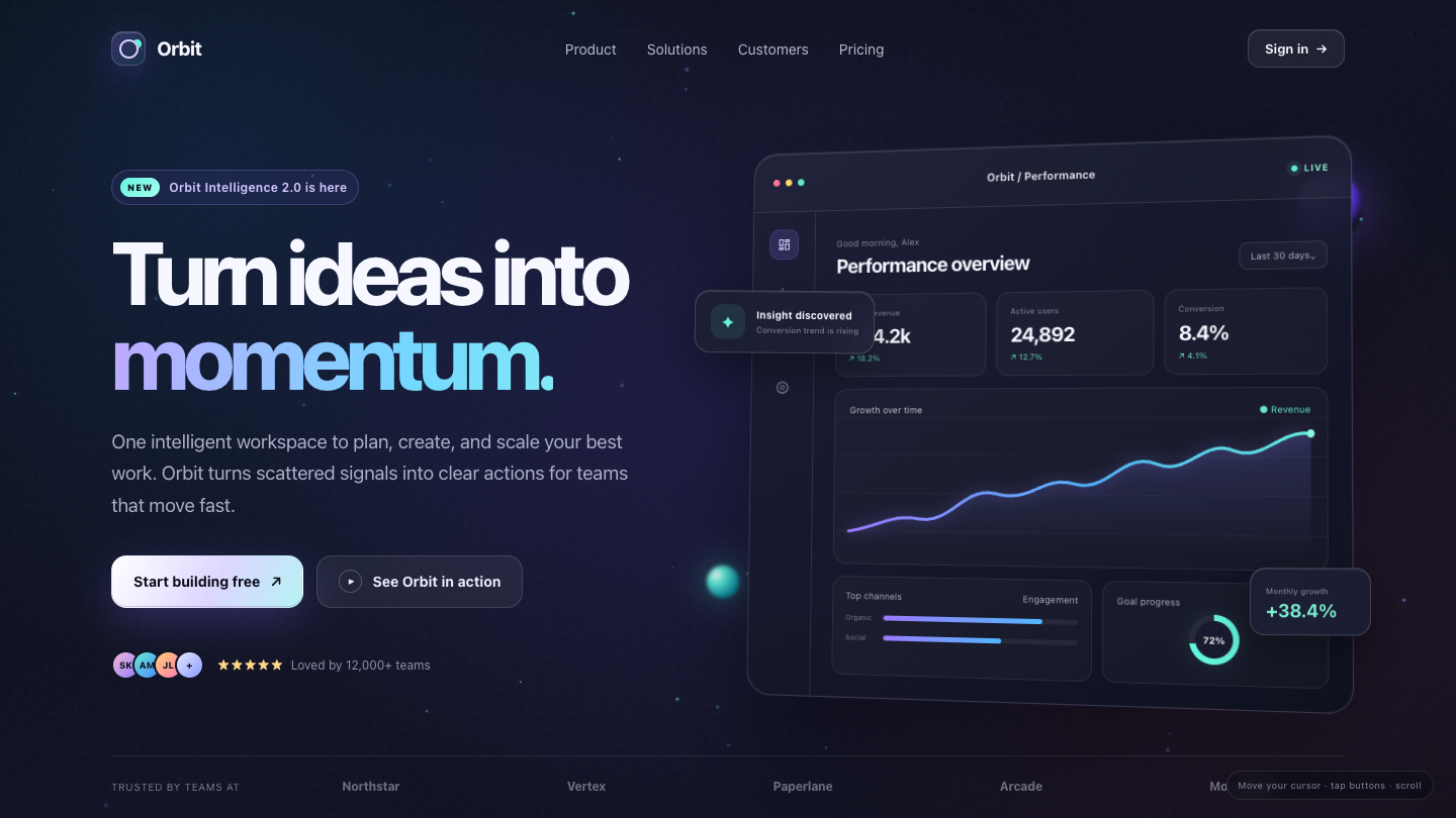
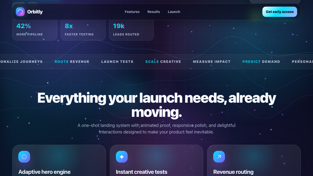
What I saw: Strong: cohesive dark cosmic theme, gradient-text headline, and a genuinely convincing dashboard mockup with charts, metrics, floating insight tooltip and glowing orbs that reads as premium SaaS. Weak: standard hero-left/visual-right layout and slight metric label overlap, but overall polish and detail push it above the field's best.
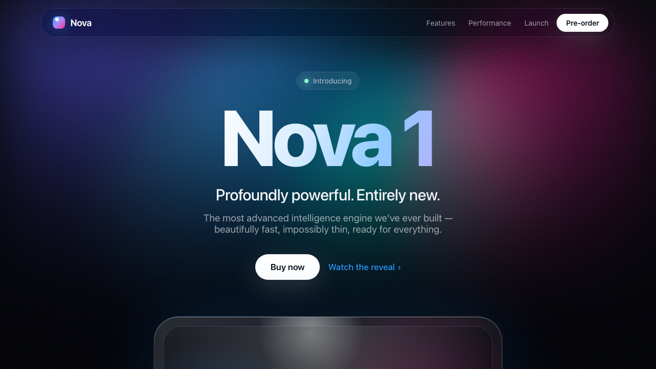
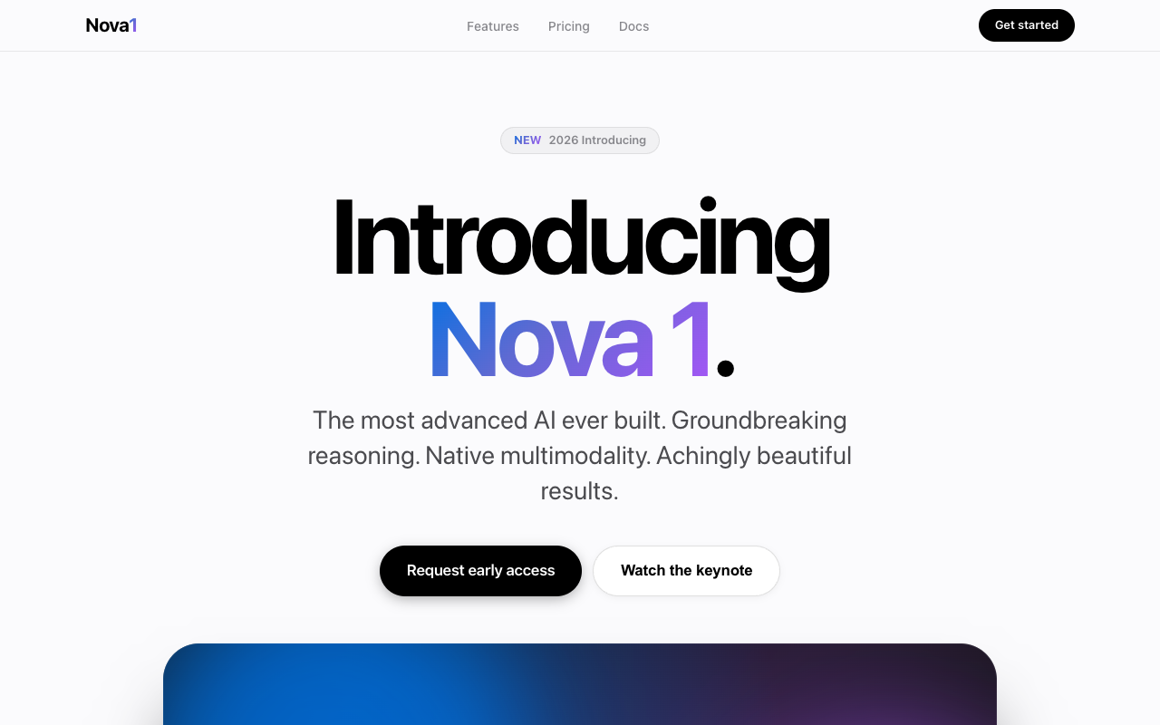
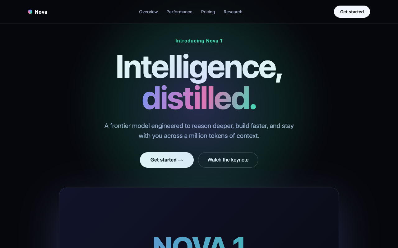
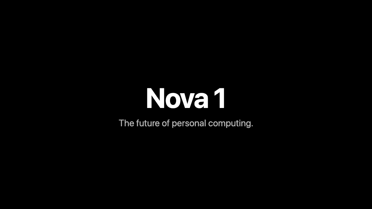
What I saw: A genuinely premium keynote page: clean nav, a gradient headline, dual buttons, tasteful type. From one sentence. Grok Build's best work of the lot.
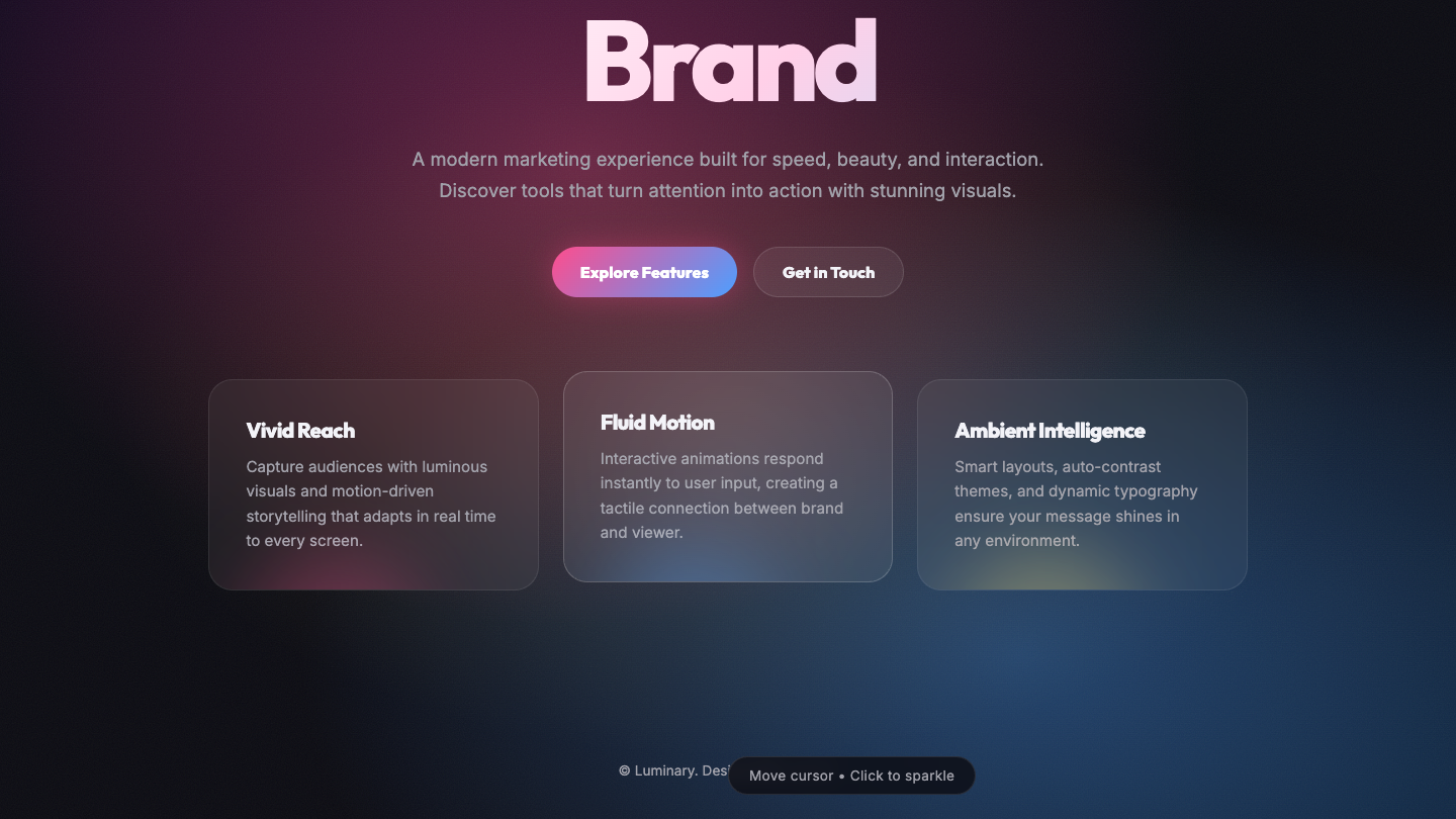
What I saw: Clean, polished dark landing with nice gradient mesh, glass cards with per-card glow accents, and a strong CTA button — but the hero H1 is clipped by the parallax offset so only 'Brand' shows (the 'Illuminate Your Brand' headline is cut off at top), plus the header/nav is scrolled out of frame, which hurts first impression. Solid execution, generic-modern copy, and the truncated headline keeps it below the top of the field.
What I saw: Funniest result of the lot: GLM and Opus independently produced near-identical premium 'Introducing Nova 1 — Intelligence, reimagined / distilled' keynote pages — gradient hero, full nav, pricing tiers. A dead heat. Kimi's was a plainer set of feature cards.
The winner on Landing
Fugu Ultra took gold on this task. winner · denser build.
What I saw: Sakana Fugu Ultra shipped a 32KB Apple-keynote landing — bigger than Fusion's 20KB attempt at the same prompt. Animated mesh gradient, multi-section, polished. $0.32 vs Fusion's $1.30 for the same output — 4× cheaper, denser result.
See Fugu Ultra's full model card: /models/fugu.
Every attempt — live, playable
Side by side. Click any tile to run that model's actual one-shot HTML in a new tab.
 ▶ LIVE
 ▶ LIVE
 ▶ LIVE
 ▶ LIVE
 ▶ LIVE
 ▶ LIVE
 ▶ LIVE
 ▶ LIVE
 ▶ LIVE
 ▶ LIVE
 ▶ LIVE
 ▶ LIVE
 ▶ LIVE
 ▶ LIVE
 ▶ LIVE
 ▶ LIVE
 ▶ LIVE
 ▶ LIVE
 ▶ LIVE
 ▶ LIVE
 ▶ LIVE
 ▶ LIVE
 ▶ LIVE
 ▶ LIVE
How I scored Landing — methodology
Three axes, 0–10 each, averaged. Runs: drop the .html in a browser; if it opens to a broken page, it scores zero. Hits the brief: did the model ship the thing the prompt asked for, or a different thing it found easier. Looks good: visual polish, motion, interactivity — where most of the gap between gold and silver lives.
My scores trace back to the source comparison guides on agentos.guide. See the full methodology page for data provenance, including which source guide each cell's score came from.
Related
More page benchmarks: all tasks in the Page category · See the best AI model for Landing · Back to the leaderboard
Run this stack yourself.
Every demo on this bench was built inside the Agent Operating System — one prompt, one shot, single HTML file out. The Agent OS, the prompts, the templates, the weekly walkthroughs and 4,000+ founders shipping with it every day all live inside the AI Profit Boardroom.